Principle 1: Perceivable
Use correct code markup for every feature (for example, headings, lists, forms and tables)
In todays world of digital, everyone relies heavily on understanding the structure of a web page or document. For example, consider the page you’re on – it has a banner, introduction, navigation menu and content to read through, chunked into headed and sub-headed sections. Sighted users understand, at a glance, relationships of visual elements, based largely on the visual characteristics such as scale and position.
University guidance
Managing elements and structure
Screen readers need that same level of structure just like everyone else. With that in mind, it’s important that content creators clearly identify headings, paragraphs, lists, tables, banners, menus and forms. In the world of web, this is done within the markup of code. For example, when adding the primary heading to a page, we wrap this with the Heading 1 or H1 tag, to ensure its identified clearly as the main page header – screen readers use this mark-up top, to identify and navigate a page in an intuitive and reliable manner.
This page gives guidance on an array of these elements, and how best to utilise when putting together your page structure and content.
Headings
Adding headers to content managed websites

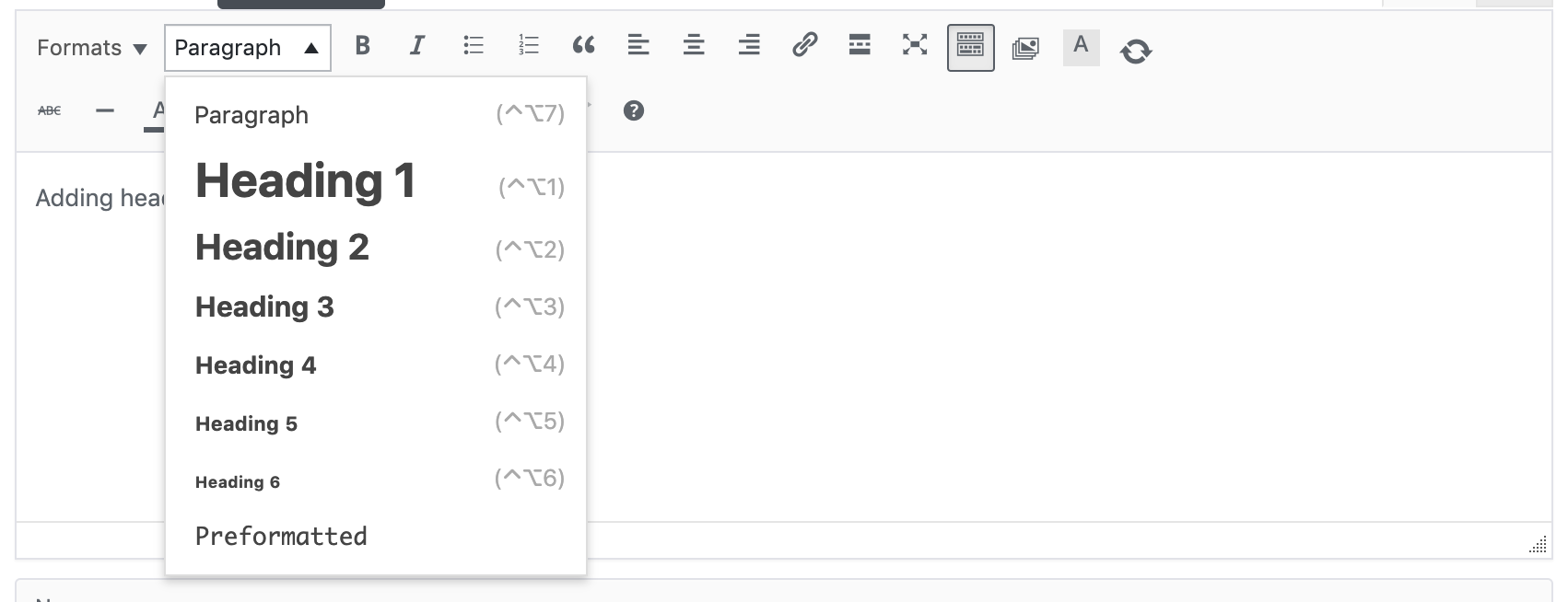
When adding content to pages using a rich text editor or CMS editor, use the Format selector on the toolbar to select the appropriate level of heading. If the heading text has not been typed yet, select the heading level first, then type. If the heading text already exists, simply select it before using the Format selector to assign a heading level.
Adding headers in software (e.g. Microsoft)
In Microsoft Word, Adobe Acrobat and other text production software, add headings using the built-in heading styles (Heading 1, Heading 2, etc.) available in the top formatting sections. To change the appearance of any of these heading styles, simplify right click on the style button and select “Modify”.
Adding headers in HTML
- Use <h1> for the main heading of the page. For most pages, there will be only one <h1>
- Use <h2> for subheadings beneath the main heading
- Use additional levels of headings (<h3> through <h6>) as needed if there are additional levels of sub-headings within your web page content.
Lists
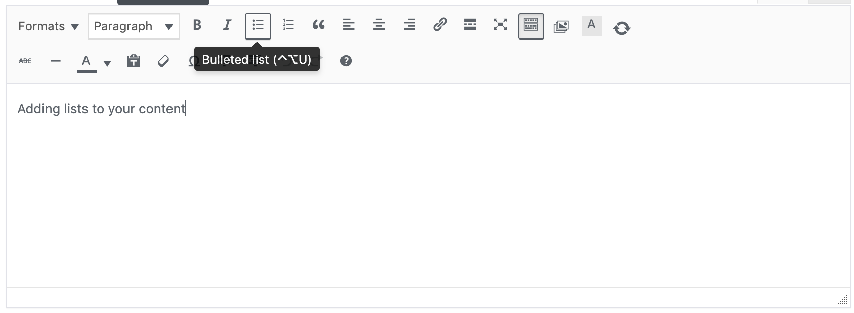
Adding lists to your content

When creating content, it is important to recognise when your content is a list of items. At the University we are partial to building pages that often include lists of links, events, staff members, degree courses, and much more. If lists are created as lists, screen readers can let the user know that they have landed on a list and can give info such as the number of items in the list. This is super helpful for users when they’re deciding whether to read on.
Features are included in most editors and software that enable you to add bulleted lists or numbered lists, typically from a toolbar.
Tables
Adding tables to house your content
Tables should be used only for presenting rows and columns of data, not for organising the layout of the page.
By creating a table of data, sighted users are able to scan its content by following the columns and rows to locate content. People who are unable to see the table, don't receive the same pointers to help them locate. Therefore, when creating a table, you must ensure that you have correctly specified what each element of a table is, so that it behaves in a way understandable to these users. For example, a column header needs to be specified as a column header, and a row header as a row header.
Tags to help assistive technologies

Accessible Rich Internet Applications (ARIA) Landmark Roles
Yes, we know - it all sounds rather complicated... but ARIA tags can be a developers best friend. ARIA is a W3C specification that provides web developers the ability to define the roles, states, and properties of user interface components so this information is exposed to assistive technologies.
Each of the eight roles represents a block of content that occurs commonly on web pages. They are used by simply adding a relevant role attribute to an appropriate container within the HTML mark-up. Once added, screen reader users can quickly jump to that section of the page. The eight roles are:
• role=”banner”
• role=”navigation” (e.g., a menu)
• role=”main” (the main content of the page)
• role=”complementary” (e.g., a sidebar)
• role=”contentinfo” (meta data about the page, usually the footer)
• role=”search”
• role=”form”
• role=”application” (a web application with its own keyboard interface)
If a role is used more than once on a page, the aria-label attribute should also be used in order to distinguish between the two regions. For example, a web page might have two navigation areas, one with aria-label="Main Menu" and the other with aria-label="Secondary Menu".
University guidance
Creating accessible forms
Forms are built up of a range of input or selection techniques which should always be accompanied by labels or prompts. In order to figure out which labels accompany which fields, sighted users rely on visual cues such as position and proximity. For users who are unable to see the form, the relationships between labels and fields must be called out within the code.
We've included some helpful tips below at a high level, but form accessibility and usability should be discussed in detail with an experience design expert and developer to ensure it is consistent with experiences across the University. You can find more information by visiting Web Aims guidance on developing accessible forms
Using the <label> Element
Labels allow us to create relationships between input fields and label content, to detail to users the desired information we wish to gather. For this to be as robust as possible, we recommend using the name and for tags within your code to ensure assistive technologies can portray this effectively.
The following code shows how we'd connect the two components together to best communicate :

Providing additional context or supportive content
Only one <label> element is allowed per form field, so if additional assistive content is required, it can be added to the form field using the aria-describedby attribute. Screen readers will announce both the label and help text when the form field has focus.